
Black for a defined edge
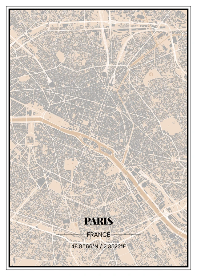
A black frame can pick up lines and dark areas in the design. Around a black city map, it connects to the print; against a pale wall, the outer edge remains easy to see.
Look for black details already in the room, such as lamps, handles or other frames. You do not need to match everything, but a repeated colour can connect several pictures.
White for light designs and walls
A white frame can feel less prominent around a pale print on a pale wall. It can suit a fine Line Art drawing when you want to notice the subject more than the border.
Against a coloured wall, white becomes a visible contrast instead. Hold a white sheet of paper beside the planned spot to judge that contrast in your own light.
Wood for a connection to your furniture
A wood colour can pick up a console, tabletop or bench. It does not need to be exactly the same shade. Compare whether the materials look warm, neutral or too busy together.
Screen colours and our room examples are a guide. The diagram below compares frame colours, not grain, frame-profile width or guaranteed outside dimensions.
Choose a frame with your paper print
Maporo paper prints have optional white, black or wood frames. You can also order the paper print unframed. Canvas is a different finish and does not use these paper-print frames.
Before ordering, check the design, size and finish in your preview. Choose wall fixings appropriate for your wall and the finished picture.
Frame colours around the same design
Black
White
Wood